WORK
From ilustrations to custom typography, from logos to layout – this is the best of my best.
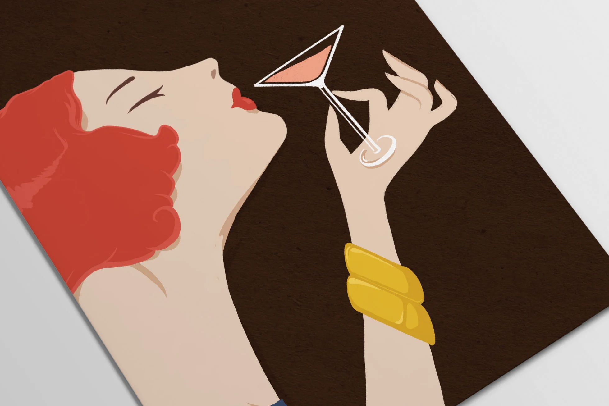
Hand-drawn illustration for the Club Charles "20's Tuesday" drink menu, taking inspiration from vintage advertisements from the 1920s that the owner was fond of.
Client: Club Charles
Art Direction: Joy Martin
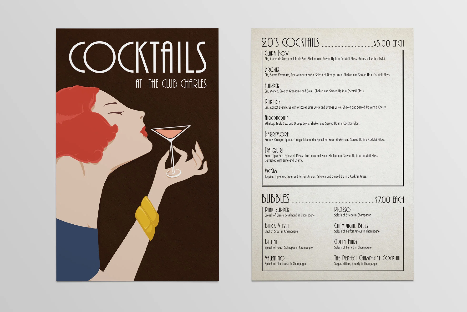
Hand-drawn illustration for the Club Charles "20's Tuesday" drink menu, taking inspiration from vintage advertisements from the 1920s that the owner was fond of.
Client: Club Charles
Art Direction: Joy Martin
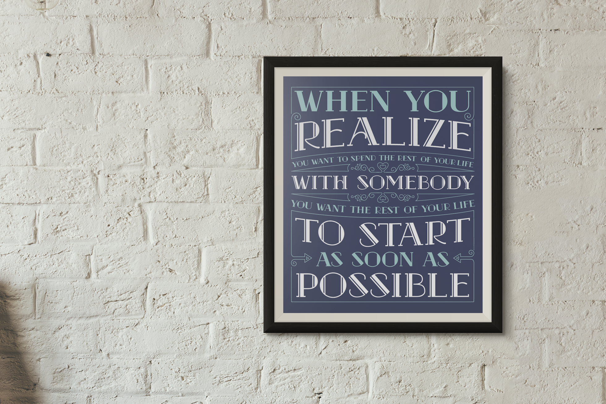
Create a typography-based poster for a friend to give to her fiancé as a Christmas present. Pulled inspiration from Jessica Hirsche and had a load of fun doing it. The final design was screenprinted on heavy paper & framed.
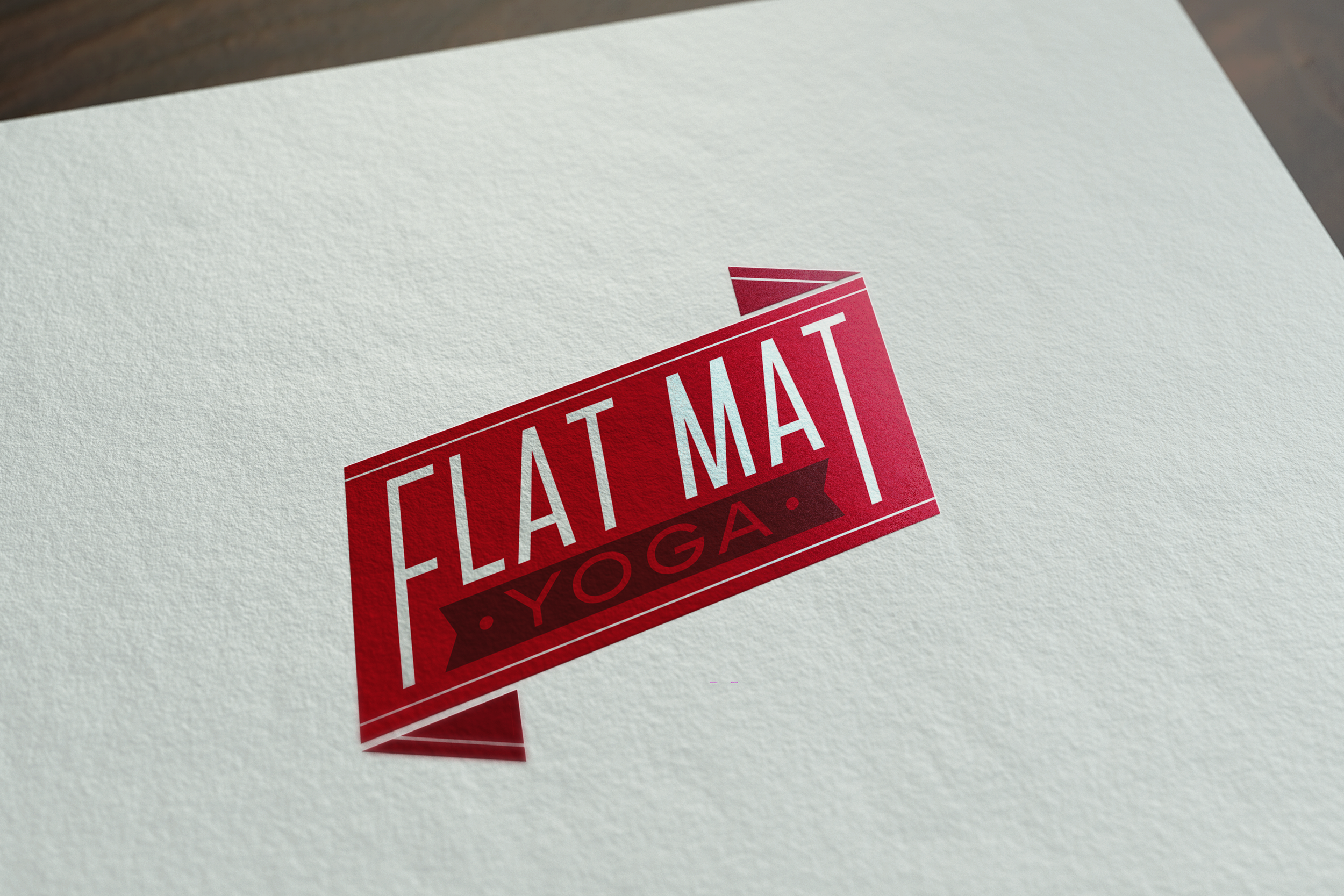
Created a logo for a Seattle-based yoga instructor looking to start a new business focusing on inspiring roller derby players to practice yoga. Working together, we decided to produce something super clean and influenced more by beer labels instead of “traditional” yoga graphics.
Client: Flat Mat Yoga
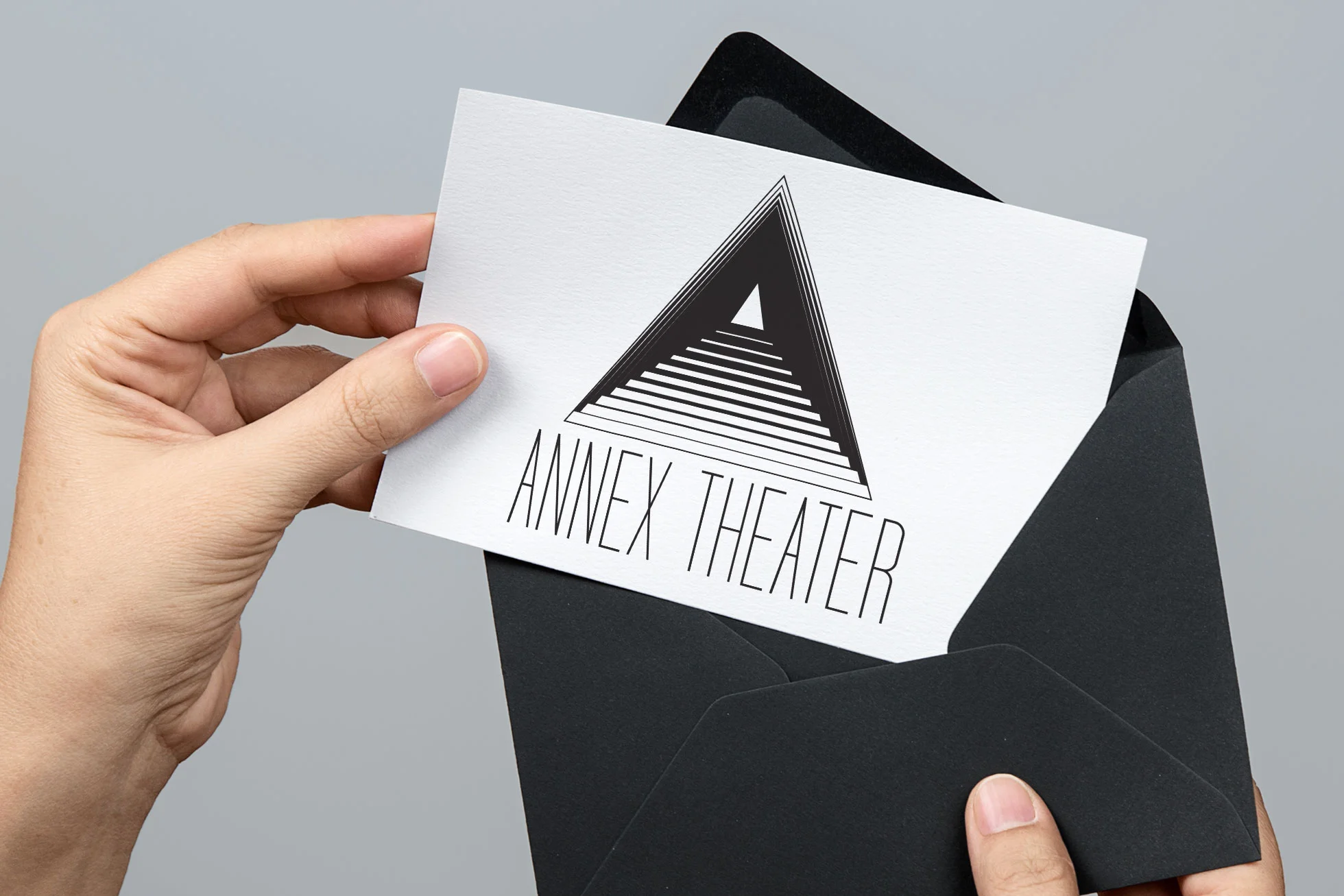
Provided the Baltimore Annex Theater with a new logo to accurately represent them in the Baltimore theater community. The logo and typeface reflect their post-modern and avant-garde approach.
Client: The Annex Theater
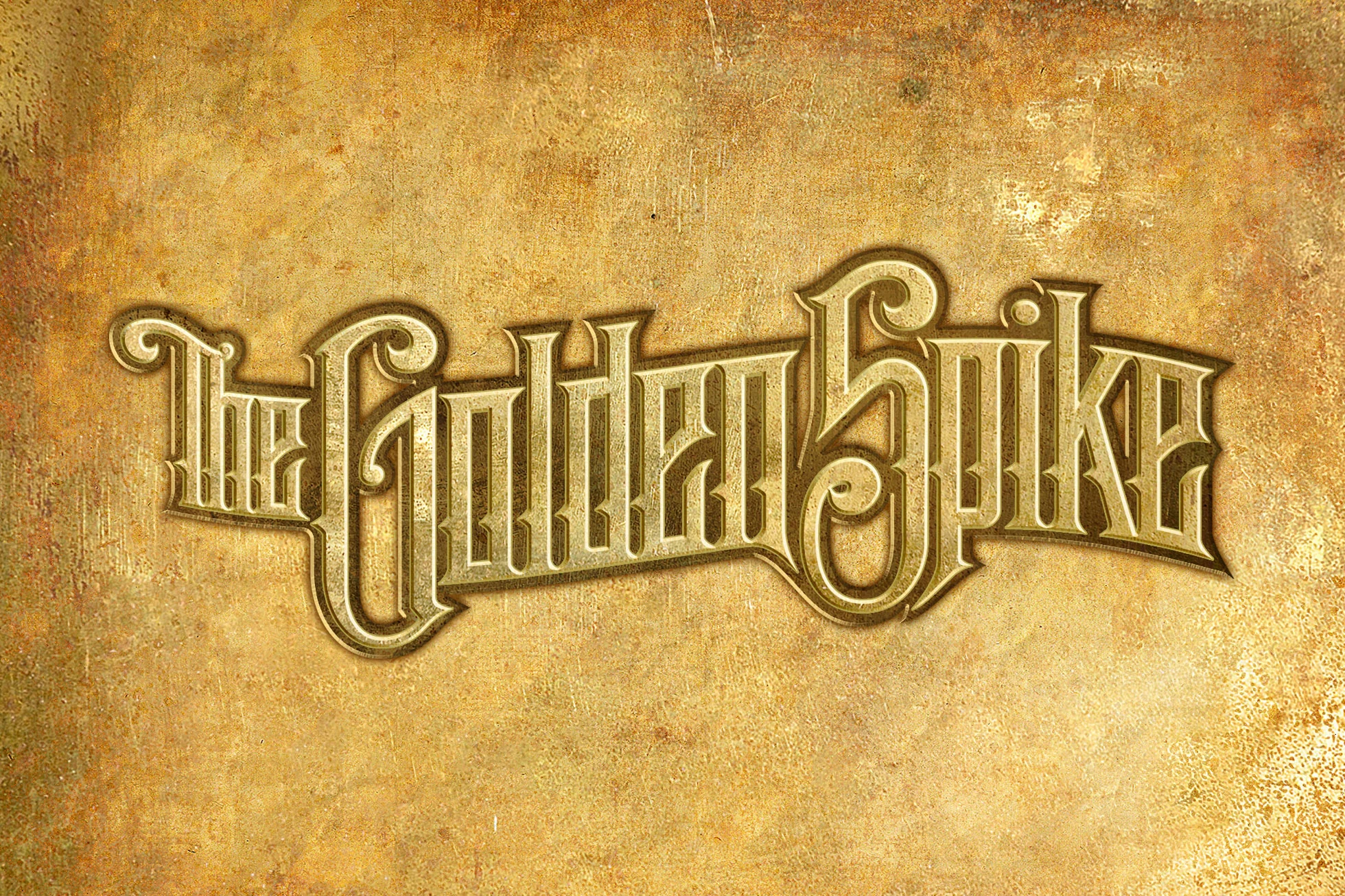
Designed some custom typography for the Annex Theater's production of The Golden Spike, a play about the First Transcontinental Railroad across the United States set in the 1800s.
Client: The Annex Theater
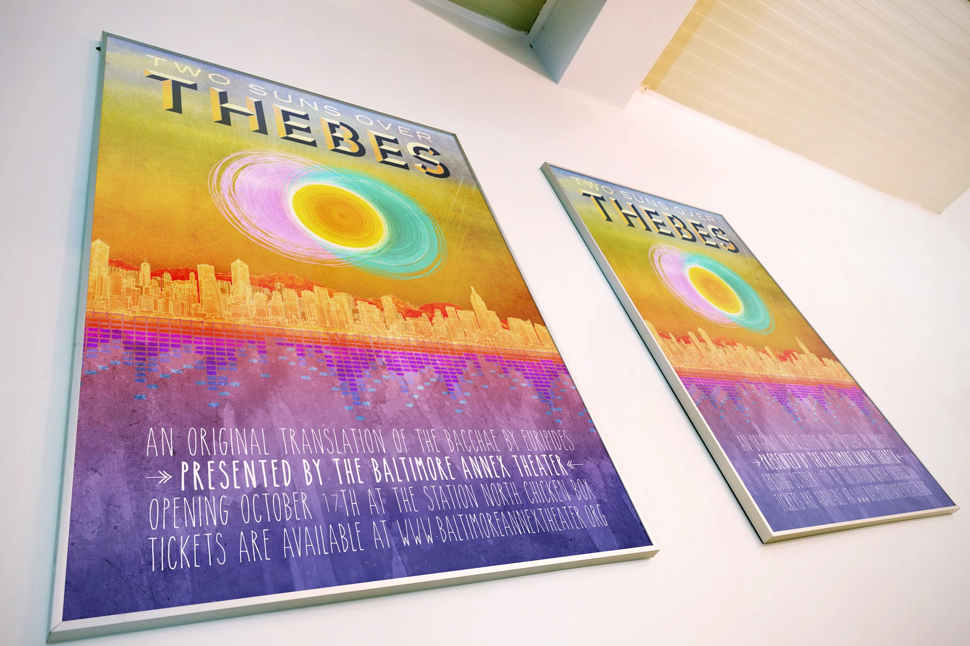
Created a poster for the Annex Theater's production of Two Suns Over Thebes – a unique re-telling of Euripides' The Bacchae. The co-directors requested no "stereotypical" imagery depicting Greek tragedy be used. The final design instead relied upon a bright color palette and hand-drawn elements influenced by the electronic-pop music in the show.
Client: The Annex Theater
Art Direction: Alex Hacker, Mason Ross
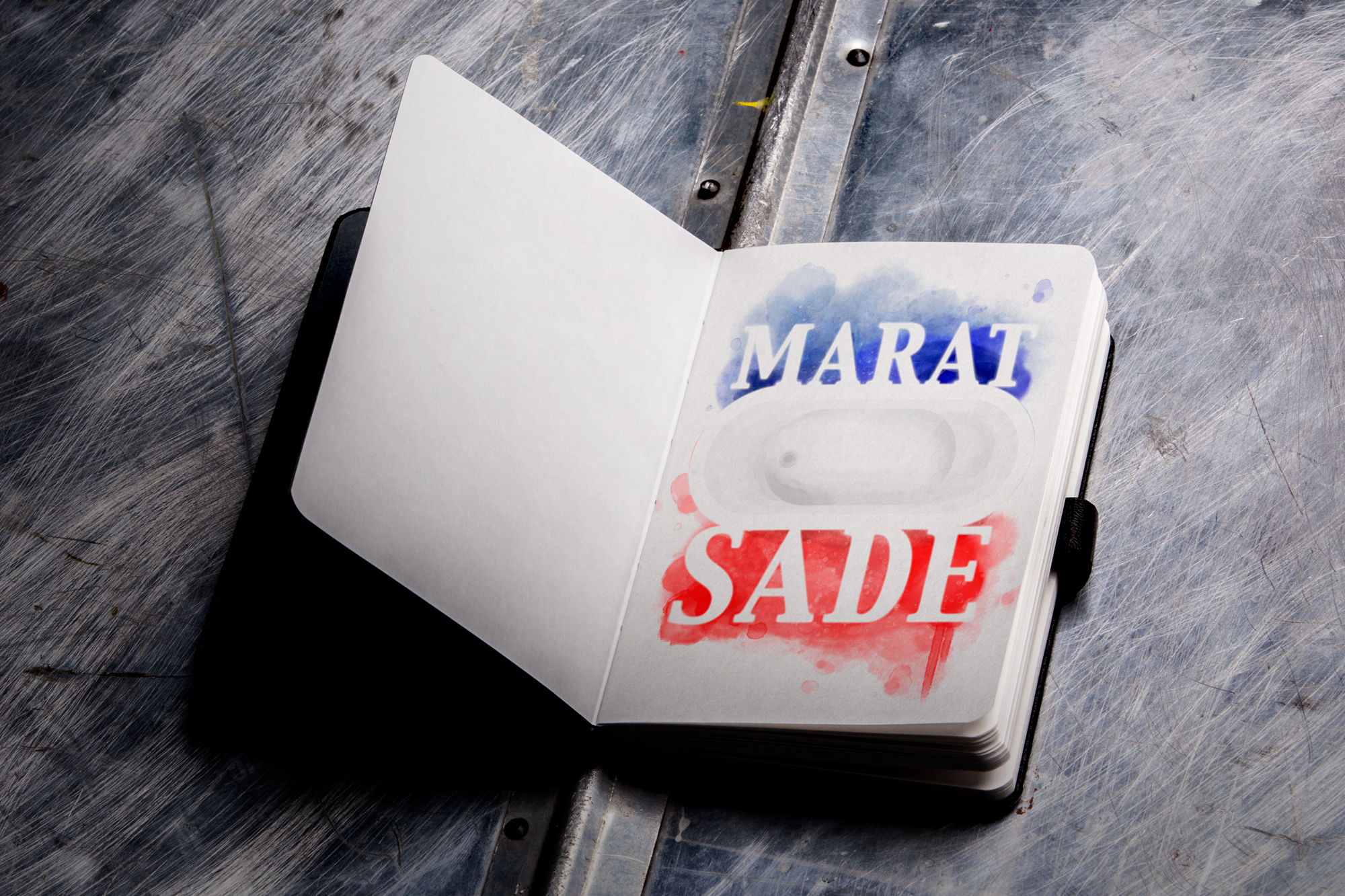
Created the promotional illustration for The Annex Theater’s production of Marat/Sade, a 2014 Best of Baltimore winner. I wanted to make something completely unconventional to the usual imagery associated with the play, and so I decided to imply the French flag through water, a bathtub, and blood. After I realized the direction, using watercolor seemed like the natural choice.
Client: The Annex Theater
Finalized logo for the Baltimore Rock Opera Society's MURDERCASTLE – an original rock opera set in the 1893 Chicago Worlds Fair.
The original concept behind the logo was to convey a sense of duality: to have a beautiful classic Victorian Gaslight-era font overlapping a gory twisted font, both reading "Murdercastle." This was to symbolize H.H. Holmes' actual Murder Castle in Chicago, which on the outside looked like a simple hotel, but on the inside was a horrific death trap.
Over the course of the project this idea transformed and simplified; I took a major element from the show, the Ferris Wheel, and made it a focal point in the logo. The typography was created based off of an alphabet I found in a book from 1900 on IAMPETH, or the International Associate of Master Penmen, Engrossers, and Teachers of Handwriting.
Client: Baltimore Rock Opera Society
Art Direction: John Decampos, Jared Margulies
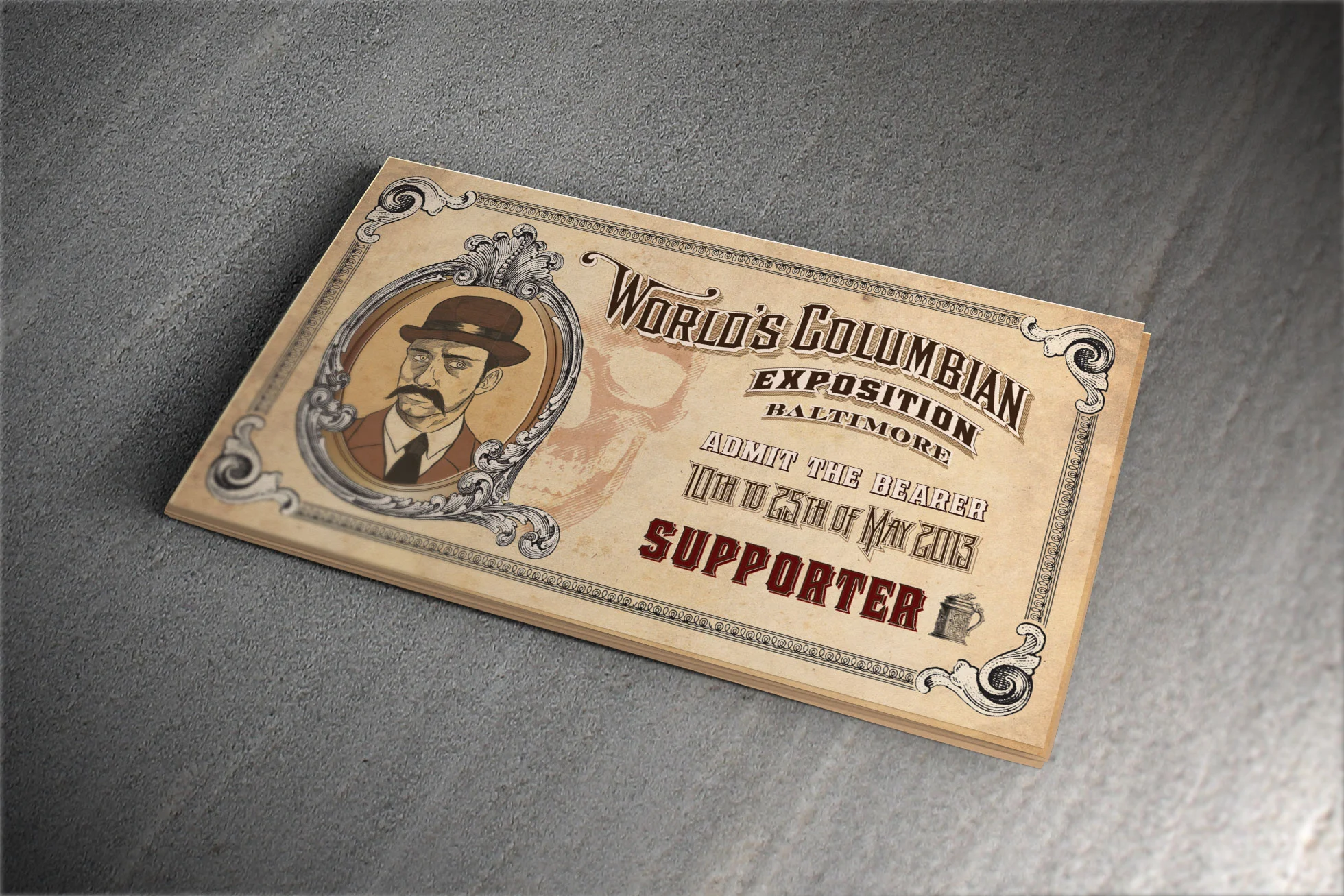
Murdercastle takes place during the 1893 Chicago World's Fair, also known as the World's Columbian Exposition. With this in mind I created show tickets modeled after the original 1893 entry tickets, with some show-specific changes.
Client: Baltimore Rock Opera Society
Additional Credits: John Decampos
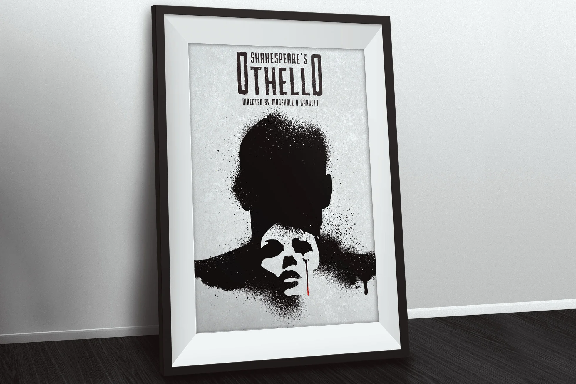
Illustrated the promotional poster for the Mobtown Players' production of Othello. I opted to create a spraypaint stencil effect in order to create a sense of rawness and tension, juxtaposing the background image with negative space.
Client: The Mobtown Players
Art Direction: Marshall B. Garrett
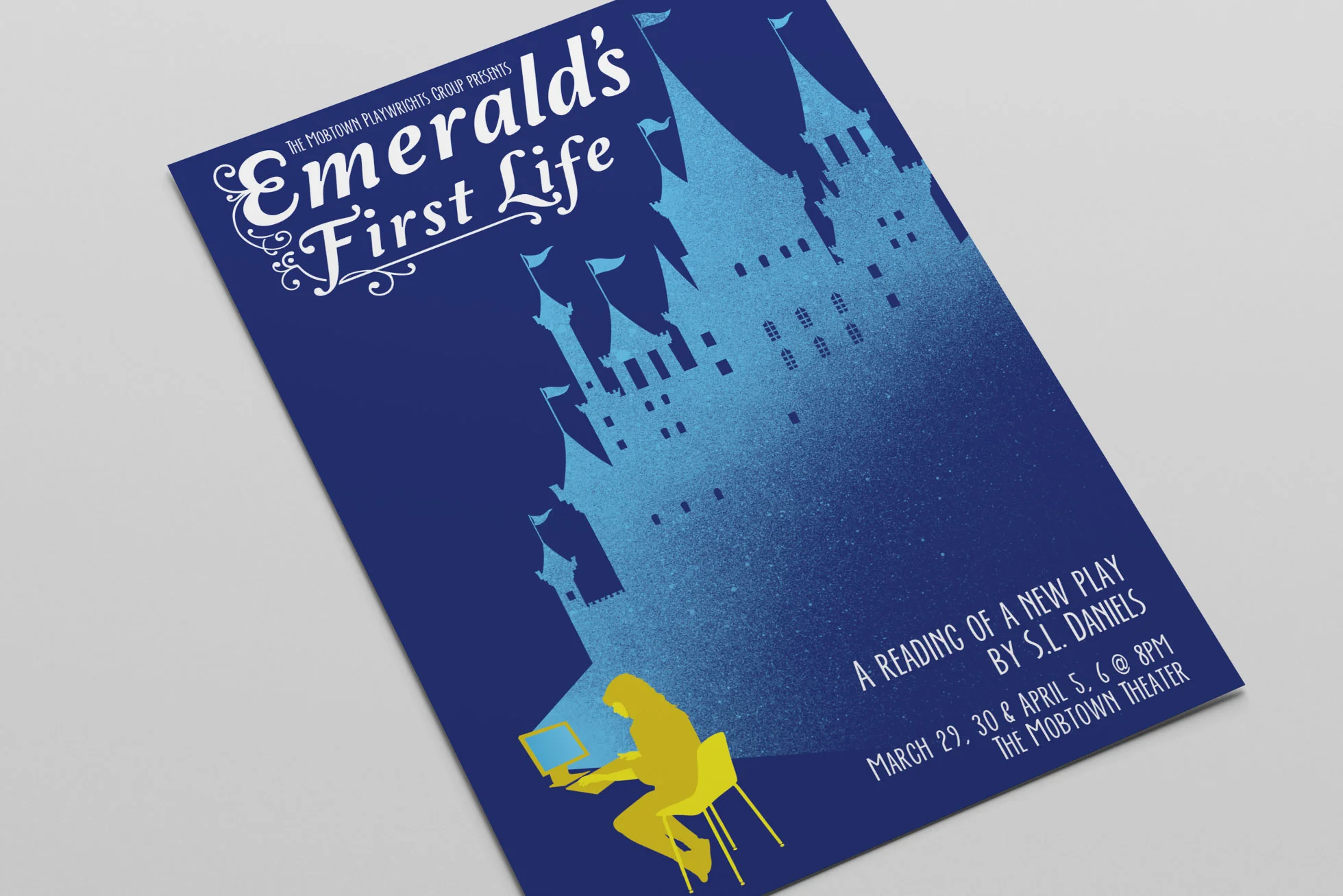
Illustrated the promotional artwork for the Mobtown Players' reading of Emerald's First Life – an original play based on the idea of living a double life inside a computer. The main character envisioned herself as a princess in her online persona, hence the fairytale imagery and typography.
Client: The Mobtown Players